G
Table of Contents
GRAPHICS
CTL-Click on a timeline graphic effect to open “Combo Graphic” page (a more
compact version of the graphics editor)-allows access to all graphic effects properties and
GOV, while maintaining access to the timeline and viewer.
ADDING a graphic preset to the timeline:
CTL-drag the preset to the timeline, and your in/out markers will affect the duration and placement of the preset.Viewing Graphics—composited result in timeline:
Go to top timeline or the timeline "outside graphics" and right-click on the "marker" stripe up on top and select "OpenViewer". Then on the new viewer push the "spike" so that the viewer stays with you when you go into graphics again.
Must select a clip before painting or adding a graphic. Hit graphics button, or add clip effect-graphics. OR Go to Graphics Layout page
FORCE OVERLAY—in sequence preferences… forces a key from alpha channel of a
clip, instead of displaying RGB channels.
GRAPHICS OBJECT VIEWER-G.O.V.
Displays all strokes in time. Changes layer order of strokes. Layers can be locked or hidden by r-clicking on layer in GOV.Stretch or shrink the duration of a stroke in the GOV. Use CROP CURVES in properties
window to stretch the duration of a stroke without stretching the keyframes. Otherwise
keyframes automatically stretch with the duration.
Clicking on a stroke—changing parameters changes the stroke. Without clicking on a
stroke, changing parameters changes the tool. Sort of like Illustrator.
Freehand Tool: Settings for tool, shape, color and strokes.
• Path: Closed, Constant interpolation, or Fast feedback.
• Curve fitting: Lower Tolerance for more points, Higher Tolerance for more cleanup.
To close a shape: Select, edit shape, then choose close shape.
Sampling Ratio: Edits brush exactness to its wire frame.
Opacity settings for both the Brush and the Brush Effect.
Paint Styles: Paint Style parameters from current tool or selected object. Parameters
contain the brush; brush effects and fill effects.
KEYBOARD SHORTCUTS
ALPHA-NUMBERS SELECT THE PAINT TOOLS
1 eraser
2 blur tool
3 Red (default)
4 Green (default)
5 Blue (default)
6 color picker
Tip: Holding down 3,4,5 will allow a re-mapping of the colors.
F2 Opens the Quick Effects Toolbar
A Select an object
S Scale
D Rotate (roDate)
F Skew
Q Polyline
• Click to add vectors, ESC to exit draw
• Control click any where to close a path
• Click and drag to direct a tangency
W Freehand
E Ellipse
R Rectangle
T Text
Y MagicY wand
NOTE: Re-order the screen buttons to match keyboard layout for consistency.
• ESC-Exits Draw
• [ -makes brush size smaller
• ] –makes brush size larger
[ ] adjust brush size
B Toggle Brush
N Toggle Fill
Control K will Copy (Kopy) any layer object (path, stoke etc.)
ENTER Edit a shape’s bezier points
ESC Exit editing a shape
LAYER NAVIGATION
Shift-3 (NUM) Move up a layer level
Shift-9 (NUM Move down a layer level
After using above keys once, you can…
Pg UP Move up a layer level
Pg DOWN Move down a layer level
VIEW
Z Zoom
X Pan
F12- Toggle FULL SCREEN view
MOVING OBJECTS (NUM PAD)
2 Nudge object UP one pixel
4 Nudge object LEFT
6 Nudge object RIGHT
8 Nudge object DOWN
Add CTL- for 10 pixels
TEXT
PROPERTIES
Turn on Filter-anti aliasing.You can set the Font on a per character basis.
Shift [ / ] to fine tune kerning
Use font hinting for static text only.
Face Cut removes the face from edge
Don’t use Font Hinting—looks bad.
Scrolling Text-Avoid vibrating text:
- Ensure "Standard Speed" is switched off
- Ensure "Filtering" is switched on in Font Attributes
SUB-PIXEL POSITION/FILTERING
The Filtering checkbox applies only filtering, and the Sub-Pixel Positioning will permit sub-pixel positioning.To get sharper edges on text, turn Filtering OFF and turn Sub-Pixel Positioning ON.
- Filtering OFF + Sub-Pixel Positioning ON ==> sharper edge
- Filtering ON + Sub-Pixel Positioning ON ==> more blurry edge
Discussion
Text rendering is a tricky thing, and DS used to be pretty terrible at it (did we get Subpixel Positioning in v7? I can't remember) -- it's
much better now but still has some room for improvement.
The reason you get soft lines is because of subpixel positioning; When the text is rasterized into pixels, horizontal and vertical features of the letters may or may not align precisely to the pixel grid depending on the size, kerning, and letting of the text block... the baseline of a letter might not wind up exactly on scanline 400, it might be on 400.3 -- which of course doesn't actually exist, so the bottom of the letter gets partially antialiased onto the line below which makes things look fuzzy. The smaller the text, the worse it stands out and looks blurry.
If you turn subpixel positioning off, things should look sharp. However if you then start animating that text in Graphics, it will move around rather chunky as the text block 'snaps' to whole pixels.
So, you just have to pick and choose depending on the situation. First, I never use Filtering - this is all we had before subpixel positioning but now it just does more damage than good. For small disclaimer-type text or anything that doesn't move, I turn off subpixel positioning; Everything else gets subpixel on. I generally leave the Supersampling at 8x8.
In the case where you need subpixel positioning for doing fine kerning or some other reason, but certain lines look fuzzy, about the only thing you can do is select the line in question and change the Character Transform in Y by small amounts (like +/- .1 increments) until it sharpens up sufficiently. Might have to do it in X too but that's usually less noticeable unless the font is very thin.
(Thanks to Bob Maple)
If you use very small letters in a roll and you are getting a wobbly feel. If the roll is white letters on black you can try to do a "manual antializing". Add a dark grey edge to the face. You will not see the edge if it's dark enough and the wobbly bits become much better.
(Thanks to Andy Loor)
For rollers I have Subpixel Positioning on, Use Antialiasing checked, and Supersampling either at 4x4 or 8x8 depending on what looks best.
(Thanks to Tony Jover)
Morphing Text Characters
See Morphing Text
Special Text Characters
© is Alt-0169
® is Alt-0174
™ is Alt-1053
Use Character Map for other special characters
Go to Windows START>Programs>Accessories>System Tools>Character Map. Choose the character you need from the display window, hit SELECT, hit COPY, then paste it into your DS title.Writing in Japanese (or another language)
I’m using the standard MS MINCHO font that can be installed from the operating system CD.For the Japanese Keyboard Layout it’s the Microsoft IME Standard that can also be installed from the OS CD.
I’m using an English keyboard too.
You basically use the English alphabet (English Keyboard) to type out the Japanese sounds. It’s called ROMAJI.
If someone needs more assistance, I’d be glad to help.
By the way there are only 5 vows in the Japanese language.
A=あ I=い U=う E=え O=お
For the rest, you just add a consonant to each of the vows.
KA=か KI=く KU=く KE=け KO=こ
SA= SI= SU= SE= SO=
and so on…….
I’ve never used the Character Map method.
First of all, the language settings must be set in Windows.
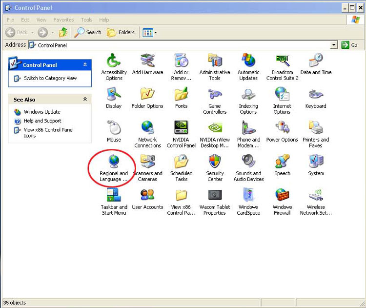
- Go to Control Panel / Regional and Language Options
- Go to the “Languages” tab and select the “Install files for East Asian languages” check box.
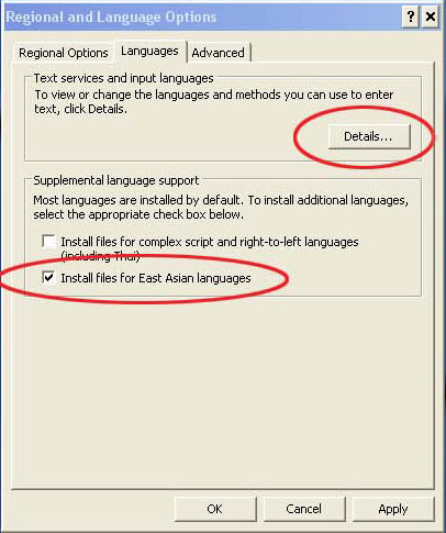
- Click “Apply”
- Once it’s finished copying the files, Restart the machine.
- Go to Control Panel / Regional and Language Options / Languages tab.
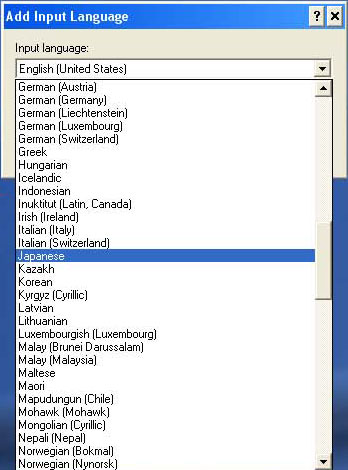
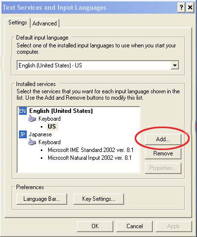
- Click “Details”. In the “Settings” tab, click “Add” and Select “Japanese” from the Input language list. Click “OK”.
 Confirm that the Japanese Keyboard IME is listed in the ”Installed Services” list.
 - Click OK.
- On the bottom right corner of your TASK bar, you should now be able to select between Japanese and English.
Now inside DS, go to the Graphics panel as you would normally do when you type English Text.
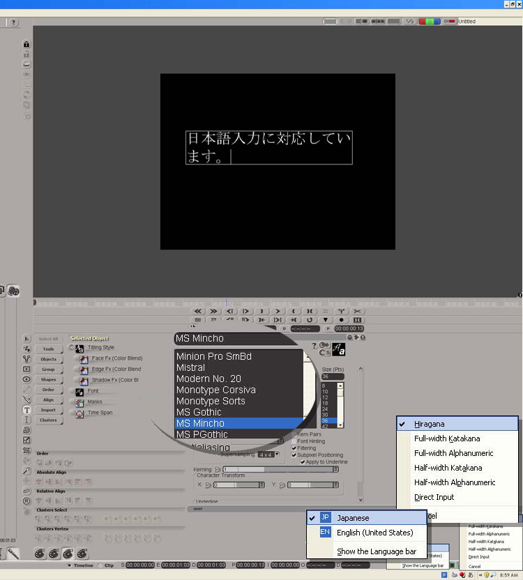
- Select the Text tool, and click in the Source/Record monitor viewing area.
- Make sure you select the desired Japanese font.*
- Select the Japanese IME at the bottom right corner of the TASK bar.
- Also make sure to select “Hiragana”.
- Start typing.
*By installing the Japanese Language option in the previous step, you should find 2 or 3 default fonts.
- MS Gothic
- MS Mincho
- MS PGothic
- If you installed 3rd party fonts, you will need to select those instead.
- The characters appear in the top left corner of your source/record monitor, and once you press “ENTER”, the confirmed text will appear in the TEXT area that you designated.
- Sometimes, the language bar might be detached from the TASK bar and get behind the DS window. If that happens, click on “Show the Language bar”, which is located right underneath the Japanese and English IME menu.
(Special Thanks to Tomio Iwasa)
Please note: Avid DS's Graphics Tool does not support writing in a language that goes from right-to-left, such as Hebrew or Arabic. Additionally, the sub-titler, which is built on the paint/titler module does not render right to left fonts correctly.
(thanks to Jean-Marc Porchet)
Animating individual Text Characters
Select the text box and hit the "text to strokes” button. It creates a layer for each of the letters and makes it much easier to animate individual characters.Handwriting Effect
- Add a Graphics effect on the clip.
- Type your text.
- Draw a brush stroke color blend over the text body.
- Trace each character with the brush stroke. Make sure the stroke fully covers the characters. That brush stroke will be used as a mask later in your graphics session.
- Select the text body and set the following Masks properties: "Use alpha channel" and "Invert".
- Cut the brush stroke(s) in the clipboard.
- Now, apply another Graphics effect on the clip and push it below the first Graphics effect.
In the Graphics effect below the other one, paste the brush stroke(s). Set the following properties on the stroke(s):
- Brush FX: load the Reveal effect
- Masks PPG: set the "Paint On Channel" to Alpha only
- Stroke PPG: click on "Forward" handwriting
The brush stroke(s) has a handwriting animation. It will "reveal" the text characters over time.
That method works better if the font does not represent a "cursive script". If the brush stroke(s) reveals parts of a character that you don't want, you can "patch" those parts with other strokes of the same nature...
TEXT HANDWRITING EFFECT… another method
- Type text
- Create a single brushstroke that covers the words from start to finish as if you were handwriting it. This can be rough-ish at this stage.
- Edit the shape so that it covers all the text neatly, not forgetting to cross the Ts and dot the Is.
- Fill the stroke with an Erase
- Animate the stroke with "Handwriting".
- Process
- Edit shape slightly
- Repeat 6 & 7 "for a couple of hours"
Two more methods (courtesy Spencer)
Way 1
- Make sure your brush fill color for the Alpha is set correctly. (Black or White)
- Make sure your not painting on the RGB and that your Painting on the Alpha channel only. Check the correct check boxes in the Masking tab.
- Once your "effect" is painted/built/animated. Place the output of the Graphics node into a composite node above your background image.
Way 2
- Paint a Black & White "Wipe Effect" animation within the Graphics node.
- In a tree add a "Key Combiner - Luma" effect.
- Plug the Black & White animation into the "ALPHA".
- Plug the .png image into the "RGB" portion of the Key Combiner.
- With a Composite node, mix the output of the Key Combiner - Luma into a layer ontop of your Background Footage
You need a composite tree (or composite layers) because the Graphics "Node" can only handle one input at a time. (unless you link to clips with the clip effect... but this probably isn't the best work flow.)
Way 2 will give you the most flexibility. You will be able to edit, effect, alter your "Matte" with various effects that Trees have to offer and that the Graphics node does not.
Rolling Titles
- Create a black (bg) clip that's way longer than you need. You will cut it later.
- Apply a GFX effect, and create the text body for the roll.
- At the intended beginning of the roll, place the text body in its start position (usually barely bottom-off-screen).
- Set a keyframe in the Transformations property editor.
- Move the play cursor forward by 1 second.
- Enter the Y displacement value for the text body according to the frame rate of your sequence. That is:
• 30, 60 or 120 pixels for an NTSC sequence (30 fps)
• 25, 50 or 100 pixels for a PAL sequence (25 fps)
• 48 or 96 pixels for an HD (24 fps) sequence (although some problems arise because of progressive segmented frame display)
- 7. Set a second keyframe.
- 8. Open the animation editor
- 9. Select the curve for Transformation Offset Y
- 10. In the Animation Editor's Curves menu , choose Relative Cycle.
The animation for the Y value will now be extrapolated backwards and forwards to infinity.
At this point, you can see where your roll ends, and cut it off there.
If the roll needs to have a specific duration, you can extend or compress it by fiddling with the text body (Leading, font size, and/or paragraph spacing) without changing the roll speed.
Text with an Inner Shadow
To create the inner shadow look on text like in Photoshop, you can use anything with an Alpha. But if it is not premultiplied, you will have to add a Premultiply effect before anything in the following tree:

In the Negative node, on the Masking tab turn off R/G/B processing and turn on Alpha. In the Composite node, set L2's Alpha to 'Atop'. Adjust Drop Shadow to taste.
Tthanks to Martin Balk and "Sexy" Bob Maple)
Fading Titles/Graphics
1. Fade in and fade out buttons in the graphic properties. BUT these should only be usedif your graphic strokes are going from start to end of your effects, and if your graphic
objects are meant to fade up to 100% opacity including shadows. Otherwise you will
screw up most of your graphic work. The buttons fade all graphic objects at the same
time.
2. Text, Titling Style properties page… set keyframes on face, edge and shadow of each
individual text object. That is the place where you have most control although it is messy
to have to work face, edge and shadow individually.
3. Do it from outside the graphics panel by leaving all graphic and text objects without
fades and dissolve from the clip without the graphic effect to the clip with the graphic
effect. OR razor a clip if you need to fade inside the same clip.
4. You can use the layers opacity slider to fade graphics in and out on the layer and you
can use 0 alpha generated black clips on a video track above your clip with a graphic
effect on top and use one sided transitions (alpha fade in and out) to fade the graphics.
CLONING TOOL
Cloning is raster paint based on vectors.1 will toggle to erase a stroke. An erase stroke is recorded as a stroke and can be reordered as a layer in the GFE.
SOURCE POINT—spatially, where to select pixels from in the frame. Set the Source point: In-place, Relative of Constant. Pick cloning source point with the “6” key.
SOURCE FRAME—
RELATIVE pick an offset for previous or later frames to select pixels from.
ABSOLUTE—specify a timecode to select pixels
Burning frames in cloning upon frame change as an option instead of rendering the container in the parent timeline. This is NOT Undo able. It will prompt with a warning before burning; this warning can be disabled.
IMPORT ILLUSTRATOR EPS
File must be created as Illustrator 8 for Windows. Can be .EPS or .AI file. Letters thathave strokes inside of strokes, such as A or O will be displayed with the inner strokes
filled. To fix this, select the inner stroke and the outer stroke of each affected letter, and
use “Combine Strokes”. If you do not need to animate individual characters, you can
select an entire word, sentence, or paragraph and “Combine Strokes” on the whole
thing at once.
PAINTING ON FRAMES VS. FIELDS
24 FPS film transferred to NTSC VideoBoth deinterlacing and reinterlacing and 3/2 contact and 3/2 expand require rendering.
3/2 contract your clip. Find the first bad frame of a sequence and apply
the effect. You can render at this point or not depending on whether you
want/need the cache yet. Render on frames if you do.
Apply a graphics effect and do your work. Render on frames.
Apply a 3/2 expand. Render on fields. Try rendering this on both ways and
see which one works best.
If you want to paint on fields you have to deinterlace first, paint on the fields and then
reinterlace to put it back together.
Rectangles with rounded corners
To get a round corner on a rectangle as you draw it, draw the rectangle and hold down the [ or ] keys. Round to suit!
OR
Select the Rectangle tool and set a Corner Radius in the main tool's PPG.
If you have all ready drawn the rectangle, you cannot round the corners after the fact.
TRANSFORMING OBJECTS
There are actually two sets of transformation animations available for graphics. One is onthe main transformations property page and the other is when you are in "edit shape
mode".
To fix undesired “jumps” in tracking, or to make a quick simple move, it can be easier to
jump into "edit shape" mode, select all the vector points and move them into position,
rather than using the transform properties. Just remember at the frame before the jump to
set a keyframe on the "edit shape" property page or you will get a slow float.
Polyline Tool
Q: When working in the graphics tool polyline function, how do you "break" the curve handles so that you can operate them independently from one another?
A: Hold down 'B' for Break and manipulate one or other of the handles.
- U will 'Uniform' them again.
- if you select a clip and press T you will get Time.
- H adds the handles if they were not exposed.
ARTIFACTS
If you are having trouble with artifacts remaining on screen while moving graphic objects around, try purging memory caches.Revised: Jan 18, 2010 12:12 pm